

Brand & Visual Identity
Building systems brands can grow with

I lead brand identity by defining the systems and visual languages that allow organizations to scale with clarity and cohesion across teams, touchpoints, and real-world contexts.
Unstoppable Awards Identity System
A scalable internal recognition system rooted in brand consistency and emotional resonance.
Challenge
The Unstoppable Awards program needed a visual identity that felt meaningful, celebratory, and consistent across multiple formats - from print to presentations to event materials - without becoming overly rigid or disposable.
Role
I led the visual expression of the program, shaping how the awards system appeared across touchpoints while ensuring alignment with the broader PT Solutions brand.
Approach
I developed a cohesive identity framework that balanced emotional impact with scalability. Rather than creating one-off assets, I focused on a system that could be reused and adapted year over year - ensuring recognition felt intentional, branded, and unified across experiences.
Company
PT Solutions Physical Therapy
Year
2022-2025
A flexible identity system designed for celebration without losing brand clarity.
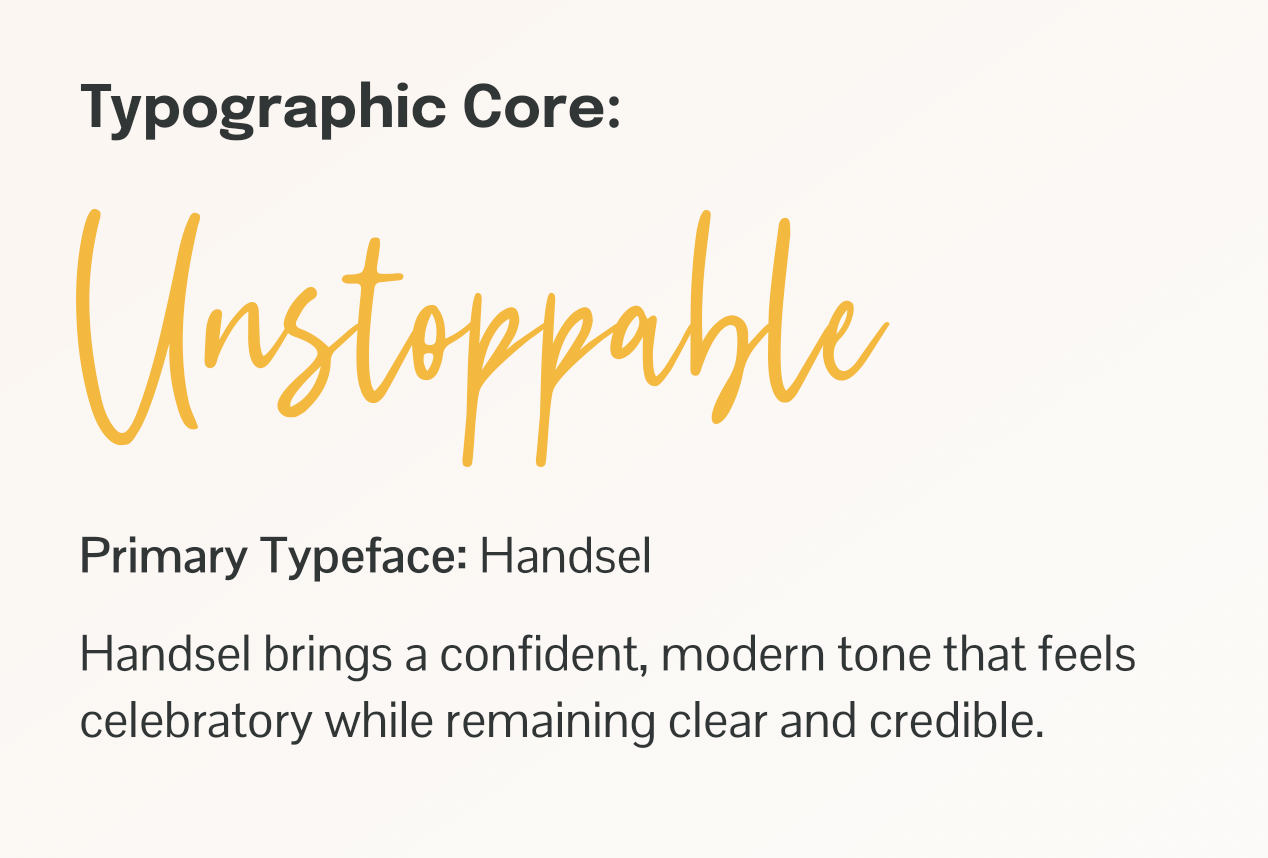
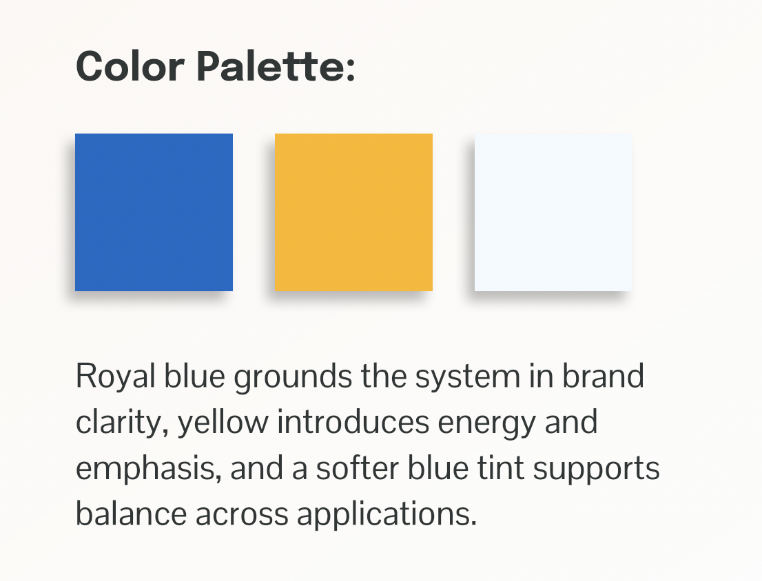
The identity was designed to scale across formats - signage, print, and event materials - without fragmenting the message.
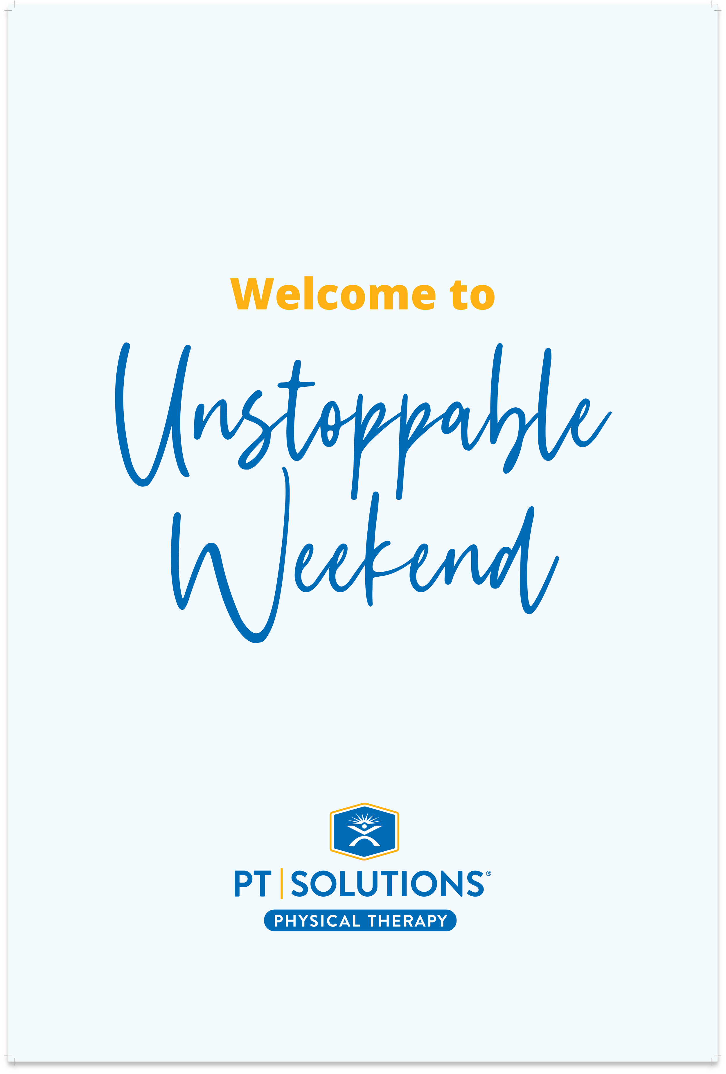
Event Signage & Wayfinding
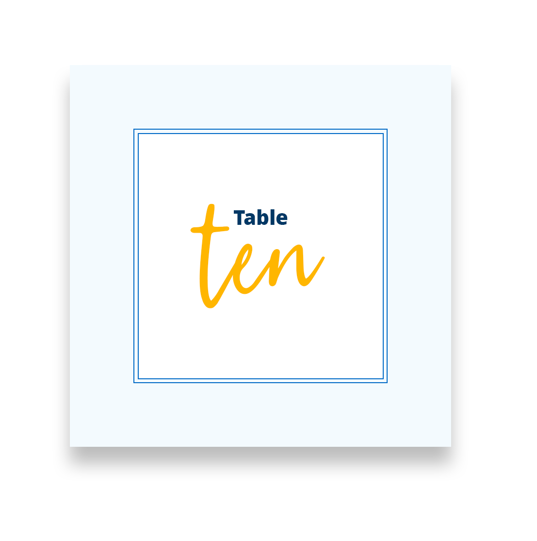
Table Placecards
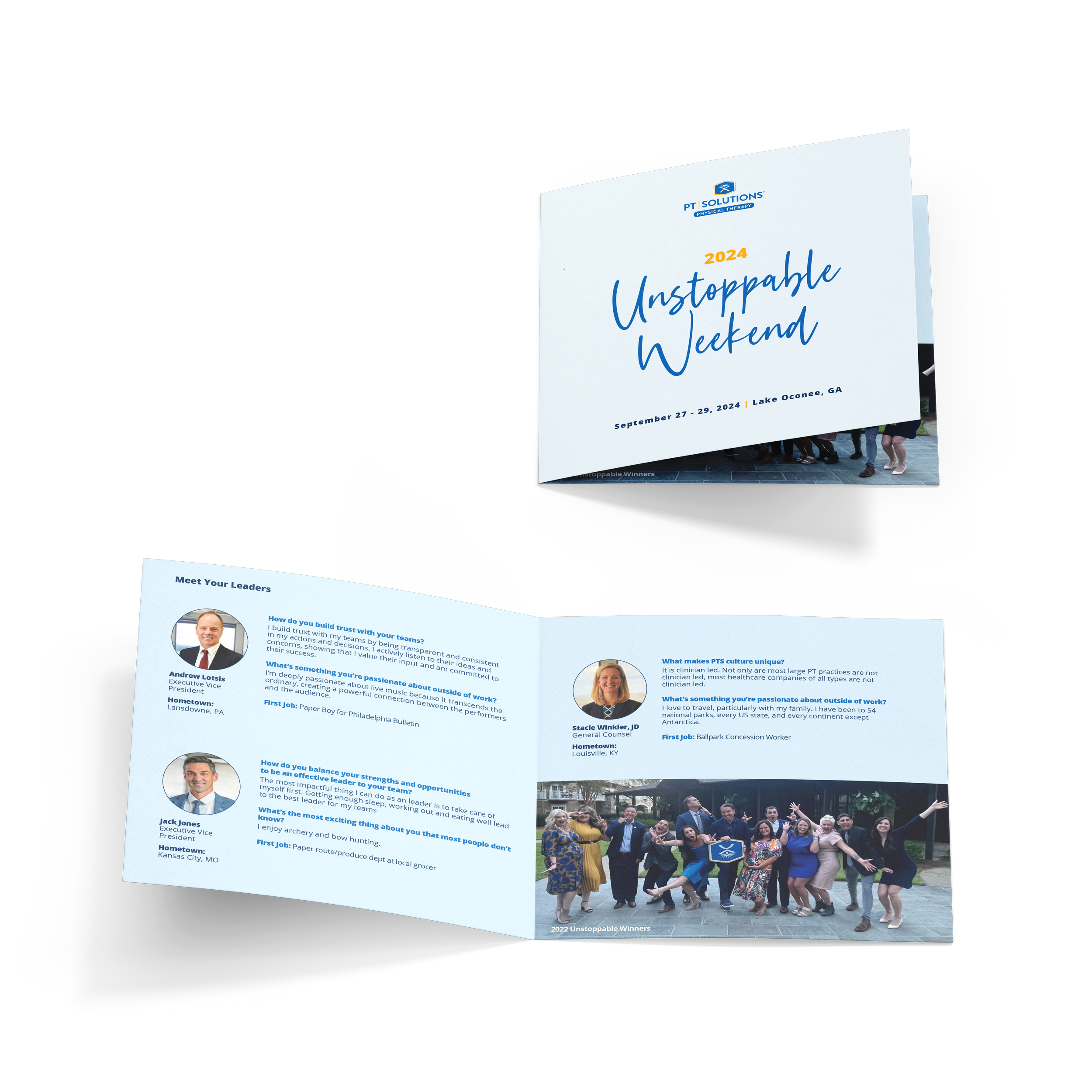
Event Program
Emotional Logic Framework
Design choices were made to elevate recognition into something felt, not just seen.
The system maintained clarity and recognition across environments without becoming rigid.
CSM Conference Visual System
A unified visual language designed to carry a brand across a multi-touchpoint live experience.
Challenge
CSM (Combined Sections Meeting) is the largest annual physical therapy conference in the U.S., bringing together clinicians, students, educators, and industry leaders. PT Solutions’ presence at CSM required a cohesive visual system that could scale across a wide range of materials - environmental signage, printed collateral, presenter posters, and supporting assets - without fragmenting the brand experience.
Role
I defined the visual direction for how the PT Solutions brand showed up throughout the conference, ensuring consistency across all attendee-facing touchpoints.
Approach
I created a modular visual system that balanced flexibility with cohesion. By emphasizing shared visual language rather than isolated executions, each element reinforced the others - resulting in a single, intentional brand experience across the event.
Company
PT Solutions Physical Therapy
Year
2022
System Overview
Typography
Color

Pattern

Logo
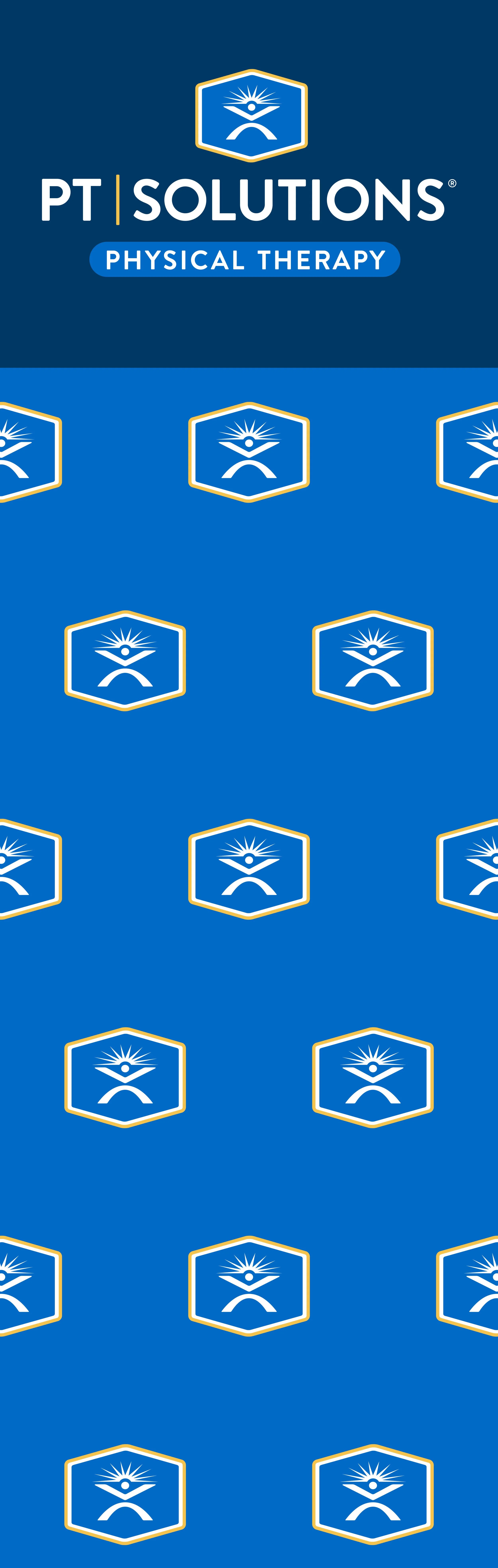
Core building blocks for cohesive evolution across all touchpoints.
Message Architecture
A repeatable message framework allowed new content to be introduced without disrupting visual consistency.
System in Use
Designed to hold together across scale and format.
The system enabled PT Solutions to show up consistently across dozens of touchpoints - reinforcing brand recognition in a crowded national setting.
Physician Referral & Community Materials System
A systemized visual language built to ensure consistency, clarity, and flexibility across physician and community materials.
Challenge
As physician-facing and community materials expanded across regions, the brand’s visual voice became fragmented, weakening recognition and consumer trust.
Role
I led creative direction and the design of the visual identity system, defining the structure, rules, and design language that aligned physician-facing and community materials across regions while supporting local flexibility.
Approach
I developed a cohesive visual language that unified layout, hierarchy, and tone, ensuring materials felt distinctly on-brand while remaining flexible across formats and local needs.
Outcome
A recognizable, approachable system that extends the brand into everyday physician and community interactions with clarity and consistency.
Company
PT Solutions Physical Therapy
Year
2022-2025
Clear Hierarchy
Warm, Human Imagery
Consistency Across Formats